Cover Me is a column highlighting the stories behind great album covers, as told to Grant Sharples by the artists and bands who made them.
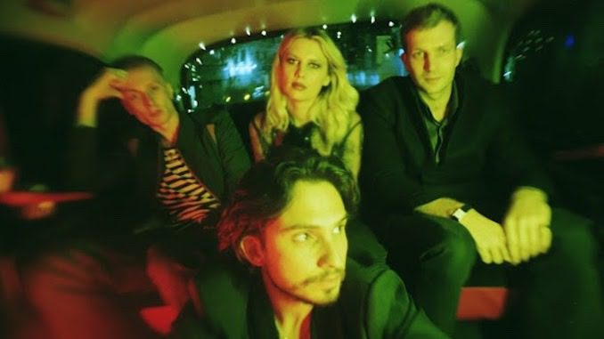
Angel Du$t are among Baltimore punk’s best and most prolific exports, and they’ve got the catalogue to prove it. From their concise, aggressive debut A.D. to the sample-heavy sonics of 2021’s YAK: A Collection of Truck Songs, the rock band, led by Justice Tripp alongside an ensemble of rotating members, is firmly at the vanguard of their scene. But just as much as Tripp has helped to shape his locale’s hardcore enclave, he has equally toyed with its form and subverted expectations by incorporating psych-rock, power-pop, and funk into the mix. They’ve taken a collagist approach to their most recent albums, but the brand-new COLD 2 THE TOUCH may just be their heaviest LP since their first. Loud riffs, pummeling drums, and throat-shredding shouts all run amok.
These details are reflected in the artwork for all six of Angel Du$t’s studio albums. Whereas the more genre-fluid YAK and Brand New Soul mirror their mixed-media environs through Zach Hobbs’ graphic medleys, the cover of their latest record is far more direct: its subject is a cop with a dollar sign for a face, a potent symbol of the capitalist greed that drives the police state. Even when the lyrics themselves lean autobiographical or oblique, that political undercurrent still runs through it, from the ferocious instrumentals to its powerful cover art.
For the latest edition of Cover Me, I spoke with Tripp about the story behind every Angel Du$t album. Subjects discussed: Pokémon; other monsters (real and imagined); collages; Deafheaven’s Sunbather; being a hardcore band but not really; the original imagery of YAK that was canned for trademark reasons; the perils of political pandering; and why it’s important to just let Zach Hobbs cook.
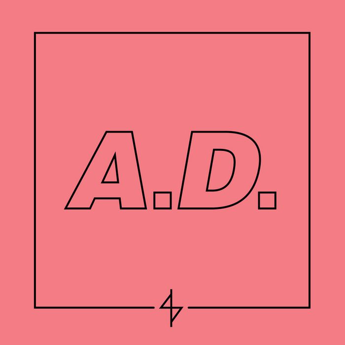
A.D. (2014)
Paste Magazine: This is a pretty solid introduction to the band in terms of the cover. It’s just a nice, simple typeface. Who designed it? Was it Evan Wivell?
Justice Tripp: Yeah, I don’t know if he is now, but he was running React! Records and he was putting out the record. We had an EP before that. He did the artwork for Xtra Raw, and it was just really simple and about cool lettering and typeface—something that was broad. You could see it from across the room, and you knew what it was. That was the big thing we were talking about. We just wanted some big letters, with that record being called A.D.. I remember he sent me a big file that he was working on to show what the image would look like. And I think, at the time, it was either black or blue, but the file got corrupted when he sent it to me, and it turned like a peach color. And I was like, “Oh no, dude, this has to be pink. That’s what the record’s about.” You know, it’s funny: the first couple records have a color theme, and I think that the first couple records have a musical theme, too, that people kind of attached to those. Sometimes, somebody will tell me, “I like [the] pink [record],” or “I like yellow,” or “I like blue.” I know what they like about Angel Du$t when they refer to the album as a color.
It’s almost like Weezer’s color albums. When I think of A.D., I do think of that peachy color. It’s just what I associate with it.
Tripp: People were putting us in the category of a hardcore band, which we never really committed to. It’s kind of like making music that’s influenced by hardcore. But what is it? I don’t know, and I think having basically the cover be these two letters on a pink background, as a hardcore band, it’s like, “What the fuck is that?”
It almost reminds me of Deafheaven with Sunbather, where they’re like, “We’re a metal band, but we’re also kind of not, so here’s a clean serif font on a gradient pink background.” It feels like a subversion of the form in its own way.
Tripp: Absolutely, yeah.
Rock the Fuck on Forever (2016)
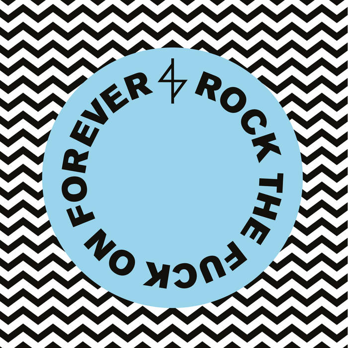
I feel like this is kind of like an evolution, like the Charmeleon to A.D.’s Charmander.
Tripp: That’s a great reference point because that was the era where I was discovering Pokémon. Dani David-Spickermann did that record’s artwork, and she was my partner at the time. She’s one of my closer friends, and we were playing Pokémon GO and writing little songs, that kind of vibe. We wanted the cover to be a couple of bold colors: cute, pretty, simple. But it can’t be just the same thing we did before. So you got this little blue circle. I think the real theme for that was the circle. I’m not saying, like, we invented the circle or some shit, but I think it led to a lot of people doing a similar thing, where circles became a theme in the album. Because where we were going with social media, where everybody’s little icon is a circle, we were able to put the little circle as our icon, and then we had a couple different little circle-themed things that we were using for the record. Again, like those first three records, including that EP Xtra Raw, the theme was just a really simple, little thing that is going to reoccur. And in this case, it was more about the circle. But, yeah, blue is the prominent color. Some people who are fans of early Angel Du$t, a lot of times refer to that record as the blue one.
Were there any inspirations that you guys were drawing from while you were thinking about this cover?
Tripp: No. Dani was driving the ship on that one. We were together all the time, and I was making little songs and she was making lots of art. She’s a brilliant artist, making all kinds of things. And then she was like, “Oh, I think this song makes me feel like this.” And it’s a pretty cool experience. I just let her run wild with it, and we all liked it.
Pretty Buff (2019)
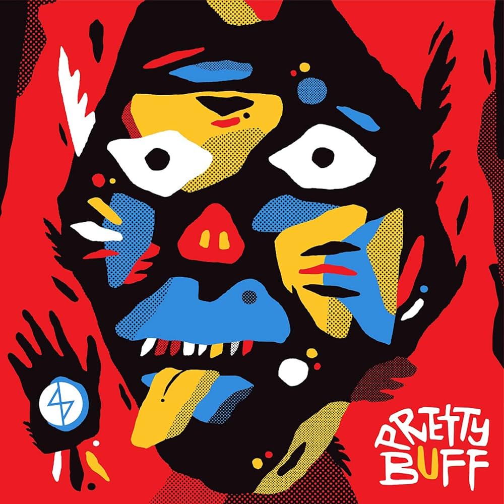
And then I feel like this is the Charizard. Who’s the little creature on this? I feel like this could be a Pokémon in its own way.
Tripp: I always call him Pretty Buff. He is pretty buff. That’s his name. And that’s the first time we worked with Zach Hobbs on artwork, which is the beginning of an era. He has been doing almost exclusively all of our artwork since then, but even before that I was a big fan of his artwork. We met at a show in Chicago, and I don’t know if he really understood the magnitude of how I was a fan of his and was excited about meeting him. He’s the cool, humble genius.
But we were like, “OK, we have to have a different theme on this. What’s the new theme? What are we going to bring? We have the little colors and shapes, and it was really simple for where the band was at that time.” The band was meant to be a return to form, in the way that early punk and hardcore demos were always pretty simple. But I think this was veering away from what the theme was and being like, “Alright, I feel like [we need] a character. We can have that strong color, and red being the solid background is cool, but I love that little monster face.” [Hobbs] was doing a lot of cool stuff like that at the time, and I told him, “I feel like we need a happy little monster that’s also scary.” It was based on some things that he had already been working on, and he put that together, and we loved it immediately.
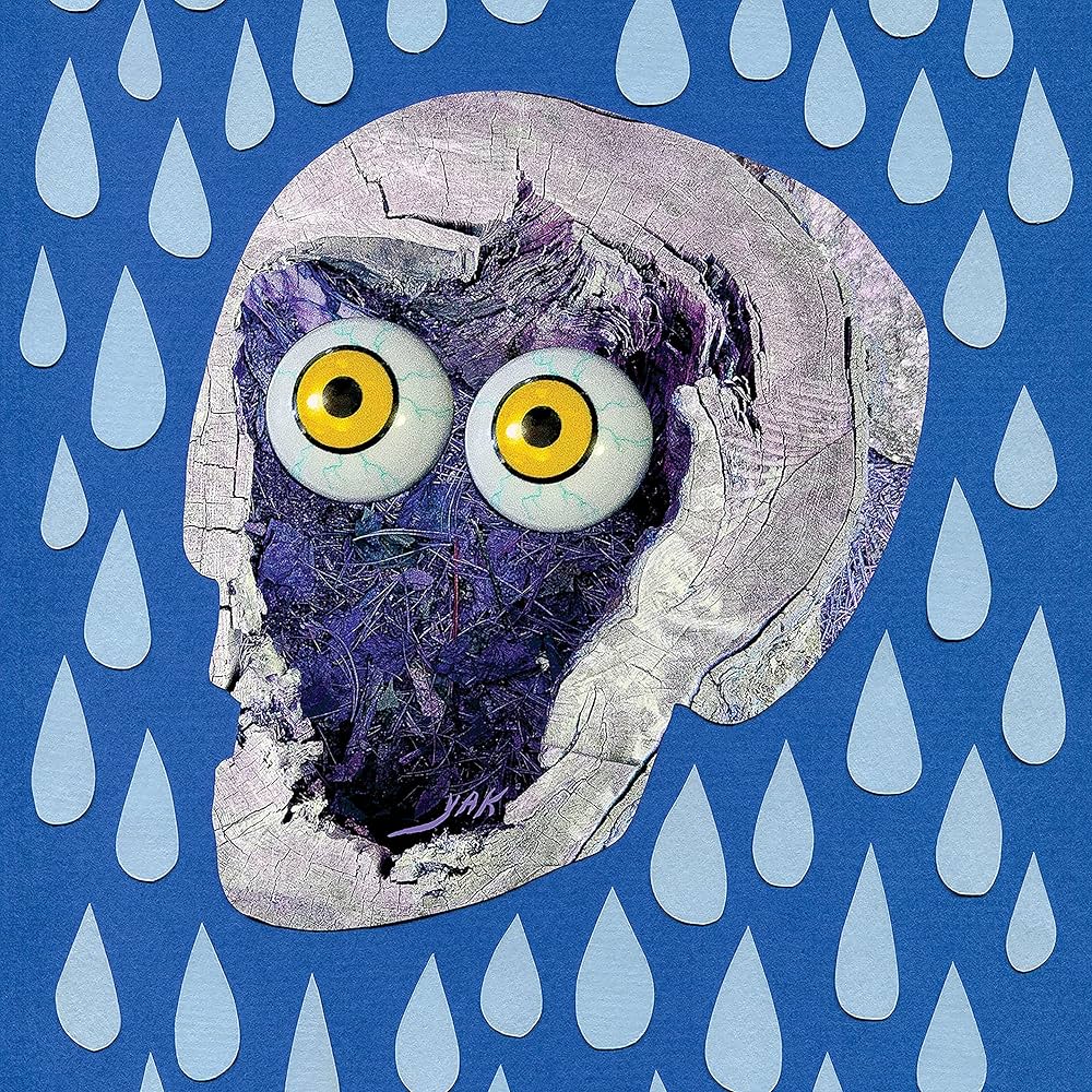
YAK: A Collection of Truck Songs (2021)
What I find interesting is that there’s another little creature here. Do they have a name? What’s their story?
Tripp: That’s just Yak. That was Zach Hobbs again, and where we were with music was, like, tapping into production a little bit working with Rob Schnapf. And we were playing with drum loops and a little bit of sampling. There are little moments that are samples and little sound things. I was talking to Zach about that, being like, “Hey, the music’s kind of going in this direction of sampling things.” And he was like, “Oh, man, it’s like collage-work in the context of visual art.” So, he made what you know as the blue background with the raindrops, but there was a different face. It was a skull. We got it approved by the label, and we were going to make the record cover. And kind of at the last minute, the label, which was Roadrunner Records at the time, was like, “Oh, shit, that skull that you guys are using is a trademarked image.”
So we had to think of a whole new record cover. And I was really into the blue with the raindrops. I was obsessing over that. We had a deadline, and I was like, “Man, I need something with these blue raindrops.” The next morning, Zach was like, “Dude, what about this?” I think he used an image of a tree stump, and then used that as a texture of the face, but the outline of the face is exactly the same outline for the skull that was originally there. So it’s got a skull element, and then the big googly eyes. The googly eyes are my favorite thing, and that kind of became a theme for YAK. It was like, “All right, we’re gonna make shirt designs with googly eyes, just big, crazy eyes on everything.”
Brand New Soul (2023)
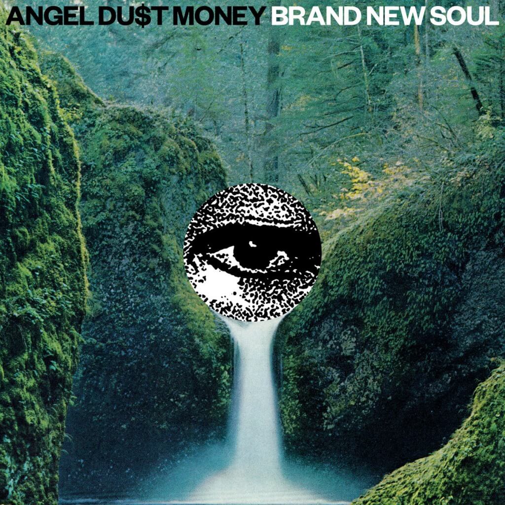
This album cover almost reminds me a little bit of the Illuminati, just because of this eye. What drew you to the imagery of this eye crying a waterfall?
Tripp: It’s Zach Hobbs just being a genius. I think there’s this almost spiritual connection. It’s like less talk is needed. He just gets it. This was a pretty fast one, where he was like, “Dude, I listened to the record, and this feels like it.” And then I saw it was, again, a little collage, and that’s kind of what we were doing musically at that time, and it works. And an eye pouring a waterfall is just the ultimate symbol of huge sadness. The record is bright—there are happy moments—but there’s always that underlying theme of being emotionally unstable and ready to crumble at any moment, and the record cover lets you know that.
Why do you think you’re drawn to these kinds of collage-like artworks?
Tripp: That’s a thing that Zach’s been on, and it works for what we’re doing, especially starting in the era where we’re getting more collagey with the sounds, just lots of loops and sound bites and stuff like that, and taking little bits and pieces from culture, and then you distort them so they’re indistinguishable or unidentifiable, and throwing it over the music, making something unique with it. The collage tells a very similar story.
COLD 2 THE TOUCH (2026)
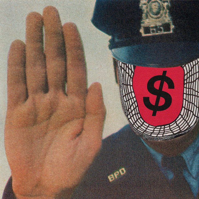
I love this cover. I think the dollar sign on the cop’s face is really cool. It feels like a pointed statement. What’s the story with this one?
Tripp: Zach riffin’! He’s got just cool ideas. We talked about wanting to avoid doing the centered monster face. This record’s a little more harsh in tone, a little more dark. I think the word I used a couple times was “menace.” I was being like, “Dude, I feel like we need something menacing. It’s got to be a deviation from things we’ve done in the past.” But it’s interesting because I do think it’s that, but it’s still such a nod to what we’ve done in the past—in the context that a monster’s on the record cover. What a lot of people see is this cop, which is just a menacing, terrifying image to most people, and then letting his face be the embodiment of all evil in the world, the dollar sign. Like, what is the most evil symbol? And we use it in the title of the band name. It’s like the silly, fun thing that we use, but contextually in this image, I think it tells the story of the band and the record a little better.
It works on so many levels. You’ve got that circle that’s calling back to the first one, and you’ve got the dollar sign and the band name. But it’s also got some thematic heft to it. It’s got the monster, but the monster is not a fictitious thing. It’s a real thing that’s got a dollar sign for a face, motivated by the greed and money that makes the system work, or not work, I should say. How does it tie into the songs here? I know that you said it’s kind of a darker record as a whole.
Tripp: A lot of the lyrics are less of a direct political statement. There are bands that can do that well artistically. With art, I never want to be too on the nose, if that makes sense. I think lyrics are important for me. It’s an important time to be an artist and paint a unique picture. A lot of the lyrical content is more personal feelings and an answer to darkness in the world. There’s never really a time when I say, “Hey, here’s my political statement,” but being from hardcore punk music, I think there’s a missed opportunity if it’s not clear on some level where you stand politically. And I think the dollar-sign cop is a good stamp to put on it when we talk about the ugly nature of the world, which appears in the lyrics, and the result of what comes from that and what it does to people.
Like, my take on that is that almost everything terrible in the world is a direct result of white supremacy, and that shows its face in so many different ways. It’s like what we’re experiencing in the United States, what people are experiencing in Gaza, or what people are experiencing in the Congo, or wherever in the world. Everybody is somewhere suffering from white supremacy right now, like the mom who can’t pay to put food on the table is a victim of white supremacy on a very large scale. A lot of people see a police officer as that. A lot of people see a dollar sign as that. So that is the political statement on the record. That is the finger being pointed that allows me to be a little more of an artist and stroke with a broader brush, if that makes sense.
The cover is an overt political statement, and then lyrically, you can be a little bit more expressive and go down these different rabbit holes that aren’t on-the-nose blanket statements.
Tripp: Yeah, you have to be really careful about art. Art comes from a place of expression, and it can’t come from a place of commerce. It can’t come from a place of sales. If I’m trying to pitch you something, if I’m trying to sell you something, I think the listener can sense that, and it’s offensive, and it will drive people away. I’m not trying to make a product. I’m trying to make a connection. It’s really sensitive when it comes to politics because there are people who try to make a product or a pitch out of politics. I’m not here to judge the artist, but for me it comes across as insincere when I’ve at least tried to do that artistically. So I think the important thing is to express what I’m experiencing as an individual. I never hide from the fact of the things that influence me as an individual. These are unifying things. It’s why a lot of people suffer. So I think it’s really important how you package that. I never want to pander for sales. I never want to come off like that. But again, just speak of your unique experience, and at the end of the day, let it be known where that comes from and what your demons are.
COLD 2 THE TOUCH is out now via Run For Cover Records.
Grant Sharples is a writer, journalist and critic. His work has also appeared in Interview, Uproxx, Pitchfork, Stereogum, The Ringer, Los Angeles Review of Books, and other publications. He lives in Kansas City.