PROMOTIONAL
For music lovers, the appeal of a great concert poster requires little-to-no explanation. That said, whether you count yourself among the most avid poster collectors or just a casual admirer, your appreciation level is guaranteed to go up a notch when you browse the poster selection at Wolfgang’s. A literal treasure trove of music memorabilia, Wolfgang’s features a head-spinning variety of classic posters for music lovers of all ages.
Here are 10 favorites—mostly first-run prints—drawn from both photos and fine-art posters for specific shows, including many commissioned by legendary Bay Area concert promoter Bill Graham.
1. Tom Petty & the Heartbreakers
August/September 1999
Heavily inspired by Renaissance painting, as well as the magical-realist style of Latin American literary giants like Jorge Luis Borges and Gabriel García Márquez, artist Randy Chavez set out to make poster art that “plays with people’s perceptions.” He succeeded with this richly colored image of a rhino jumping through a flaming hoop—which, from a distance, appears to be taking place under water or, perhaps, in a dreamlike realm. Chavez balances true-to-life detail with the altered-reality sensation that the magical-realist authors were able to induce with words. This poster, for a series of late-summer dates from the ever-dependable Tom Petty, also mentions Los Lobos and the Blind Boys of Alabama on the respective dates where they appeared as openers.
2. The Grateful Dead
Haight-Asbury, 1967
If you’re looking for a wall decoration that expresses the vibe of a cultural movement as it’s unfolding, it just doesn’t get any more iconic than Gene Anthony’s shot of the Grateful Dead hanging out at 710 Asbury Street in San Francisco. A Bay Area native trained at the California School of Fine Arts, Anthony framed the band—and the objects around them—much like a classical painter in careful pursuit of a portrait that would preserve its subject for posterity. Indeed, not only would this photo look right at home in an art museum, it also looks so lifelike that it gives you a sense of being transported back in time, as if the moment had been preserved so well that you could reach into the frame and touch it. In addition to his training, Anthony (whose work has appeared in Newsweek and Life magazine) had an uncanny ability to react on the fly, as the Summer of Love happened literally outside his apartment window. More than just a relic of the psychedelic era, this photo helped establish a visual language that’s still widely in use today.
3. The Doors / Yardbirds
Fillmore Auditorium, July 25—30, 1967
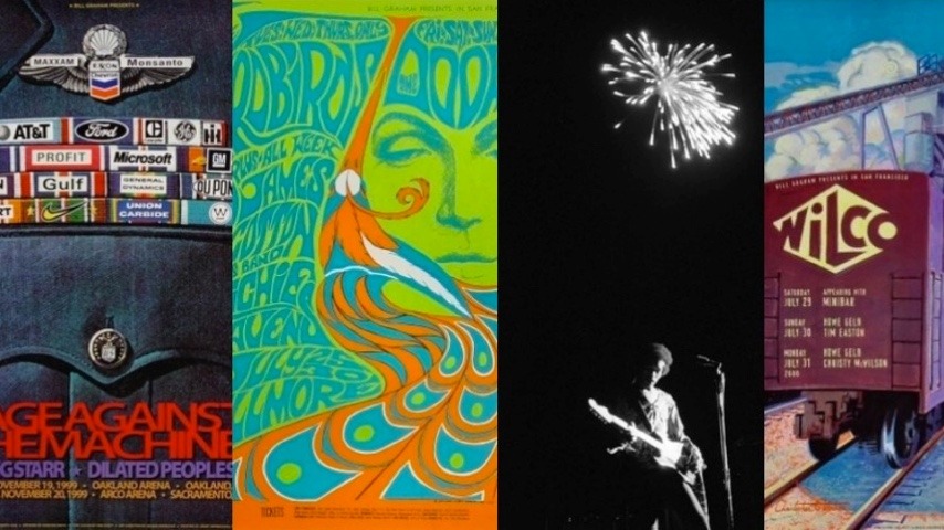
On first glance, this classic Bonnie MacLean poster gives the appearance that it advertises the Doors and the Yardbirds on the same bill. Look closer, though, and you realize that each band played two separate three-night stands at the hallowed Fillmore. Openers Richie Havens and the James Cotton Blues Band, however, did appear on all six nights. MacLean, who passed away in 2020, ascended to her role as one of the in-house poster artists for Bill Graham in 1967, after Graham, inspired by the way she drew letters on a chalkboard, decided to surprise her with an easel and art supplies for Christmas. Between 1967 and 1971, she designed a total of 32 posters for the company, many of which are still celebrated among the most enduring images from the period.
4. Sly & the Family Stone
Winterland, December 26—28, 1969
In contrast to the prototypically psychedelic stylings favored by his peers, artist David Singer preferred a vaguely futuristic approach that added an extra dimension to his posters, thanks to the juxtaposition between his visual choices and the sounds of the bands. This poster for Sly & the Family Stone’s three-night engagement at Winterland in the waning days of December, 1969 might just as easily have worked as a poster for a cerebral sci-fi films like Stanley Kubrick’s 2001: A Space Odyssey or Andrei Tarkovsky’s 1972 adaptation of Solaris. At the risk of reading too much into it, perhaps Singer captured what it felt like to be on the cusp of a new decade—or maybe what it felt like to sense that an era of unprecedented creative and cultural tumult was drawing to a close, with no clear indication of where things were headed. That his image invites these questions speaks to Singer’s knack for employing suggestion without explicitly dictating what his images are supposed to “mean.” Aside from its elegant layout and typeface (both Singer trademarks), much of this poster’s appeal lies in its open-endedness.
5. Jimi Hendrix
2nd Annual Atlanta International Pop Festival, July 3, 1970
For all the dazzle that Jimi Hendrix brought to his instrument, there’s a poignant quality to the way photographer Joe Sia captured the guitar giant silhouetted by the night sky, with a single splash of fireworks going off far above his head. Hendrix will, of course, always be remembered for his era-defining rendition of the “The Star-Spangled Banner” at Woodstock. Here, he’s photographed almost a year after Woodstock, on July 4th weekend, 1970 during a festival that also featured Jethro Tull, B.B. King, Captain Beefheart, Richie Havens, Procol Harum, Mountain and, as one would hope for a festival located in Peach County, The Allman Brothers Band—a lineup that promoter Alex Cooley assembled as an answer to Woodstock for all the Southern-based concertgoers who couldn’t make the trek up to New York State the previous summer. Like Woodstock, the Atlanta International Pop Festival didn’t actually take place in the location it was named after, but 90 miles south on a raceway and adjoining pecan grove in the small town of Byron, Georgia. Hendrix would make only five more concert appearances in the continental United States before his death two months after this photo was taken, which gives it an otherworldly, bittersweet touch.
6. R.E.M. / Sonic Youth
Shoreline Amphitheatre, May 15—17, 1995
Any one of the panels from this triptych would have worked as something you’d want to display on your wall, but artist Rex Ray opted to give each night of this three-night engagement its own visual character. The pairing of R.E.M. with Sonic Youth in Mountain View, Calif., had all the makings of a classic double-bill, the kind attendees reminisce about for decades after the fact. With the bands appearing in support of their albums Monster and Washing Machine, respectively, the bill epitomized alternative rock, both at its most arena-conquering and its most subversive. In retrospect, Ray’s typeface variations also align with the aesthetic of the era in a way that’s hard to describe yet easy to identify at first glance. It’s a testament to Ray’s design sense that he employed nine different types of lettering while still preventing the poster from getting cluttered or difficult to read.
7. Los Lobos / 16 Horsepower
Fillmore Auditorium, May 13, 1996
One of American music’s most precious treasures, the venerable rock institution Los Lobos were right in the thick of a hot creative streak when they touched down at The Fillmore with openers 16 Horsepower in 1996. At that point, it had been four years since Los Lobos ventured out past the confines of traditional roots rock with 1992’s enchantingly experimental Kiko, and the band was just a week away from releasing the equally adventurous follow-up Colossal Head. Los Lobos will always be known to casual fans as the band that covered the Richie Valens classic “La Bamba,” but for anyone who cared to pay attention, their work—during this period in particular—shattered many molds while also endearing them to fans of classic rock, jam music, blues, Americana and even the jazz/avant-garde fringe. Wolf symbolism and hybrid Mesoamerican/Catholic iconography are obvious choices for a Mexican-American band whose name translates as “the Wolves,” but artist Michael Rios tied it all together with a striking image that’s captivates your attention.
8. Steve Earle & the Dukes
Fillmore Auditorium, April 1, 1989
Few country-music figures have shattered conventional notions of what patriotism looks and sounds like more than Steve Earle. It’s only fitting, then, that Bill Graham Presents art director Arelene Owseichik chose an eagle symbol for this 1989 Fillmore appearance by Earle with his band the Dukes. Much like the MC5 brandished the stars and stripes to spark existential questions about what it means to be American, Earle has dedicated his career to uncovering the humanity in a nation that can’t help but view itself in terms of its mythology. Owseichik’s design speaks to Earle’s determination to separate love of one’s home from the reflexive self-aggrandizement that so often accompanies that love. Her visually sumptuous touch has graced posters for appearances by the Pretenders, Prince, Devo, the Cramps, the Red Hot Chili Peppers, the Cure and the Grateful Dead, to name just a handful of the many Owseichik masterpieces available on Wolfgang’s Vault.
9. Rage Against The Machine / Gang Starr / Dilated Peoples
Oakland Coliseum, November 19, 1999
There’s a great backstory to this poster: Though it was printed in advance of this show, it was never actually displayed for fear of an onslaught of lawsuits. Thankfully, artist Winston Smith’s powerful, gutsy statement about the relationship between militarism and corporate profit—which hits the bullseye on Rage Against The Machine’s message—can now grace your wall. In an artist’s version of a police lineup, the usual suspects are all here: Exxon, Monsanto, Wal-Mart, Union Carbide, Nike and a host of others responsible for untold amounts of suffering and strife, to put it kindly. Though they were only a year from breaking up when they played this show, Rage circa ’99 were still a band at the peak of their power to galvanize, with the incendiary instant classic The Battle of Los Angeles less than three weeks old at the time of the gig.
10. Wilco
Fillmore Auditorium, July 29—31, 2000
Artist Christopher Peterson chose wisely when he represented Wilco’s three-night stand at The Fillmore in the summer of 2000 with his rendering of a freight train. Intentionally or not, the poster makes a subtle play on the viewer’s associations with Wilco’s Midwestern roots. Then touring in support of Summerteeth, with classic-era members Jay Bennett and Ken Coomer still onboard, the band hadn’t quite completely shaken its “alt-country” image by that time and was still widely regarded as an Americana act steeped in heartland mythos. Peterson’s image wasn’t far off the mark, though: bandleader Jeff Tweedy’s father actually worked in a train yard, which strangely enough prevented Tweedy from feeling any romance about trains. Still, Peterson’s painting oozes with romance. Like his other work, this poster casts a warm glow despite its bright color tones—perfect for making a space feel cozy and inviting.


